Monday, 31 March 2014

Updating Website?

As I had a grey background the pages of my website looked quite boring and the tone felt more like a rock music genre than pop; this did match earlier versions of my digipak. However, as I have recently updated the look of my digipak I feel that the website should be altered too so as to correspond with both the music video and the digipak.

 
I have also been given some criticism that the home page of my website needs updating to leave only the banner as this is what most pop music websites use.

Updated Version of Digipak


Sunday, 30 March 2014

The Updating Process of Digipak


This is a prezi showing the updating of my digipak comparing the final product to the drafts.

Saturday, 29 March 2014

Further Drafts of my Digipak


With this version of my digipak I decided to use the other page with just a hint of the sparkles. However, I do feel that they just do not work on the digipak so I have decided to change this.

Digipak: Editing the Front Page


I decided to create a different image of Hannah using two existing photos which I liked different elements of.

The Image of Hannah:

 
I liked this image of Hannah, especially with the makeup and hair down. I also liked the fact that it was a close up of her, however I didn't like the background as I felt that it looked unprofessional with the houses in the background of the shot.

 
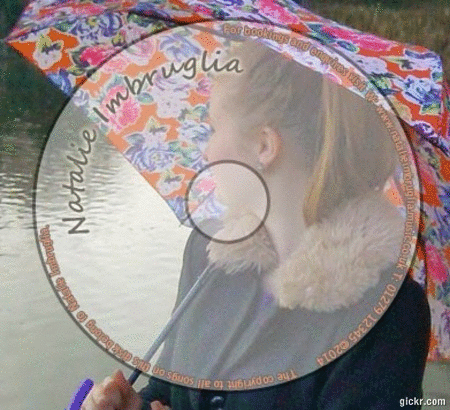
I liked the background of this image with the vibrant colour of the flowers in the background, I also felt this colour complemented the other colours that I was using within my CD so I decided to take this element to create a new photo.
 
 
I used the magnetic lasso tool to cut out Hannah from her surrounding in the first picture.
 
I also changed the colour in the background of the second picture so it gained a washed out look in order to make Hannah the central focus:


Drafting Process of Digipak


This is another draft of my digipak using the updated photo of Hannah. I feel that this fits the pop music genre, however it contrasts too much with the other images within the digipak so I will update these too.

I have also recieved criticism that the image of Hannah looking down does not look right for the pop music genre as she is not looking at the camera, I feel that this criticism is true, but I still want to use this image so I have decided to use this on the backpage of the digipak.

Friday, 28 March 2014

Changing Photo Settings


This is a screen shot of the image that I have decided to use within my digipak. I have edited this image through cutting Hannah away from the background and then changing the tint of the photo to slightly more pink.

By doing this I think that the digipak will show the conventions of the pop music genre, as this technique is seen on other pop music digipak's including Pixie Lott's where she has image tinted into a purple colour.

Another Draft of my Digipak


Within this updation of the digipak I have decided to change the front covers image of Natalie. However, I still feel that the background colour of the image needs to be changed in order to show the pop music genre. I also feel that the picture needs to have a close up of the artist, like used on many different album covers.

Wednesday, 26 March 2014

Changing the Font


I have decided to change the font of the different texts on my digipak. I have chosen to do this as I have received criticism that the fonts do not fit into the pop music genre.

The font I have decided to use on some of my digipak is similar to that on Katy Perry's Albums.


Improving Digipak: Other Page

make gifs
 
 
This shows the change I have created to the other page on my digipak. I added the sparkles to try and emulate the pop music genre and was used on Ellie Goulding's album lights.


Tuesday, 25 March 2014

Improving Digipak: CD Page


Digipak Updating: CD

gif maker at gickr.com
 
With the earlier version of the image I had Hannah's face and neck in the centre, however I did not like this as when the CD would be taken out part of her head would be missing from the CD.
 
I rectified this through moving the image slightly to the right so that I could see Hannah's face on the part of the CD.

Improving Digipak: CD Page

 
Image of hannah that will be used as the back of my cd page

Improving Digipak: CD Page


This is an image of my CD page and its improvements. I have changed the image behind the CD and changed the colour use to complement the colours of the umbrella.

Thursday, 20 March 2014

New Photoshoot: Images I Have Chosen

I have chosen to use this image as it uses an interesting pose; looking away from the camera than the conventional artist pose looking at the camera.

I also feel that this is better than the images that I have used already on my digipak due to the hair, which is down and presents an informal tone. Within this it also would follow the conventions of the pop music genre.
I have also chosen to use this image on my digipak for the other page.

I feel that this image looks better than the one that I have used on the other page of my digipak and follows the conventions better.

Tuesday, 18 March 2014

Friday, 14 March 2014

Music Video: Another Draft


With this draft of our music video we have changed the length of some of the clips and also added in some transitions to help to make our narrative clearer.